5 Tips for Styling with Pentaho Report Designer
 Comments(0)
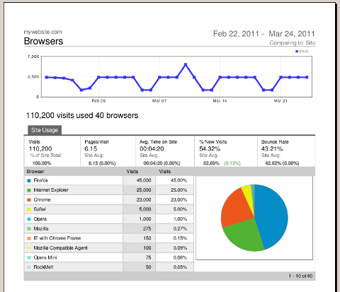
 I’m a big fan of Google Analytics, I use it for all my personal websites to see what type of traffic I get. One of my colleagues who is also impressed with their reports wanted to know if you could make a Pentaho Report look as good as Google’s output. I quickly threw together the following report, to show that you can design just about anything in Pentaho Report Designer!
Check out the PDF and HTML rendering of the report. Feel free to use the PRPT as a template for your own reports.
Here are my top 5 recommendations for folks when designing reports like this:
- Don’t be tempted to use the lines and rectangles. Instead, use padding and borders of bands and elements.
- Inline Subreports allow you to pretty much layout anything, use them!
- The message-field report element is very powerful, you can specify number and date formats as part of the message: $(field, date, MMM yyyy).
- Make sure to test rendering in the output formats that you care about. HTML renders as a set of tables, so you can’t have overlapping objects in your report.
- Take advantage of the “Paste Formatting” option, this allows you to copy colors, font sizes, etc, and will save you a lot of time.
And of course don’t forget to get a copy of Pentaho Reporting 3.5 for Java Developers :-). The book covers many topics, you can learn a lot about formula functions, chart options, shortcut keys, and much more.